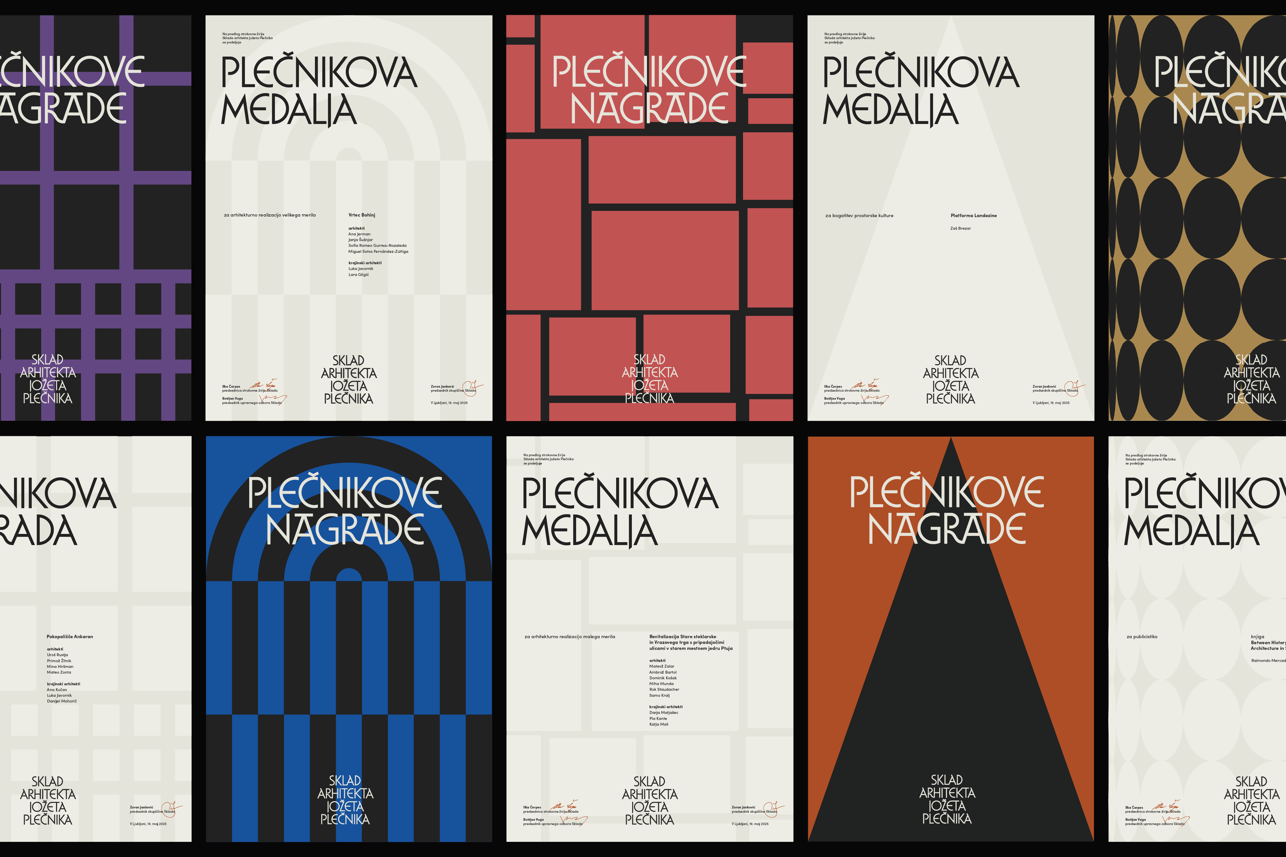
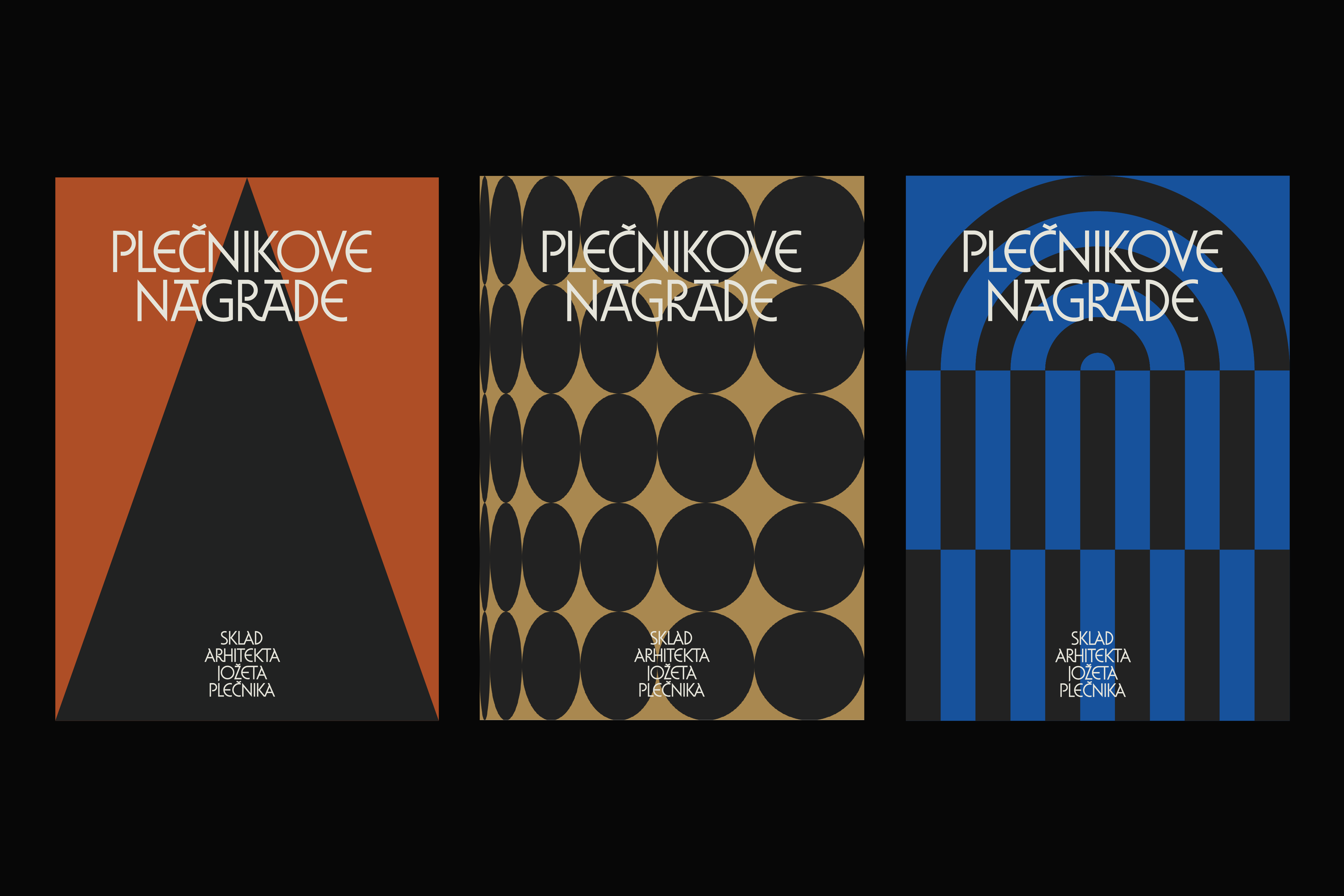
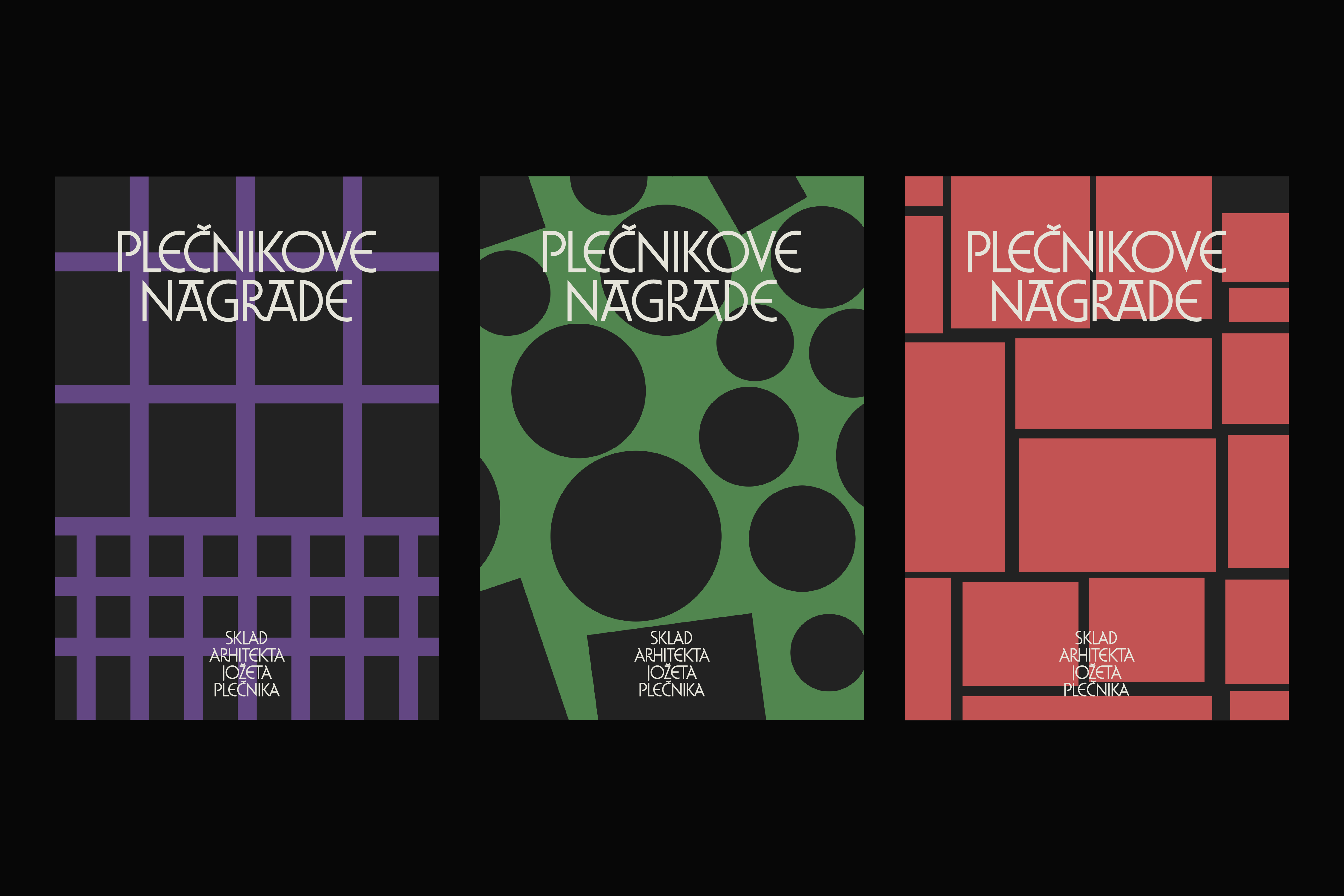
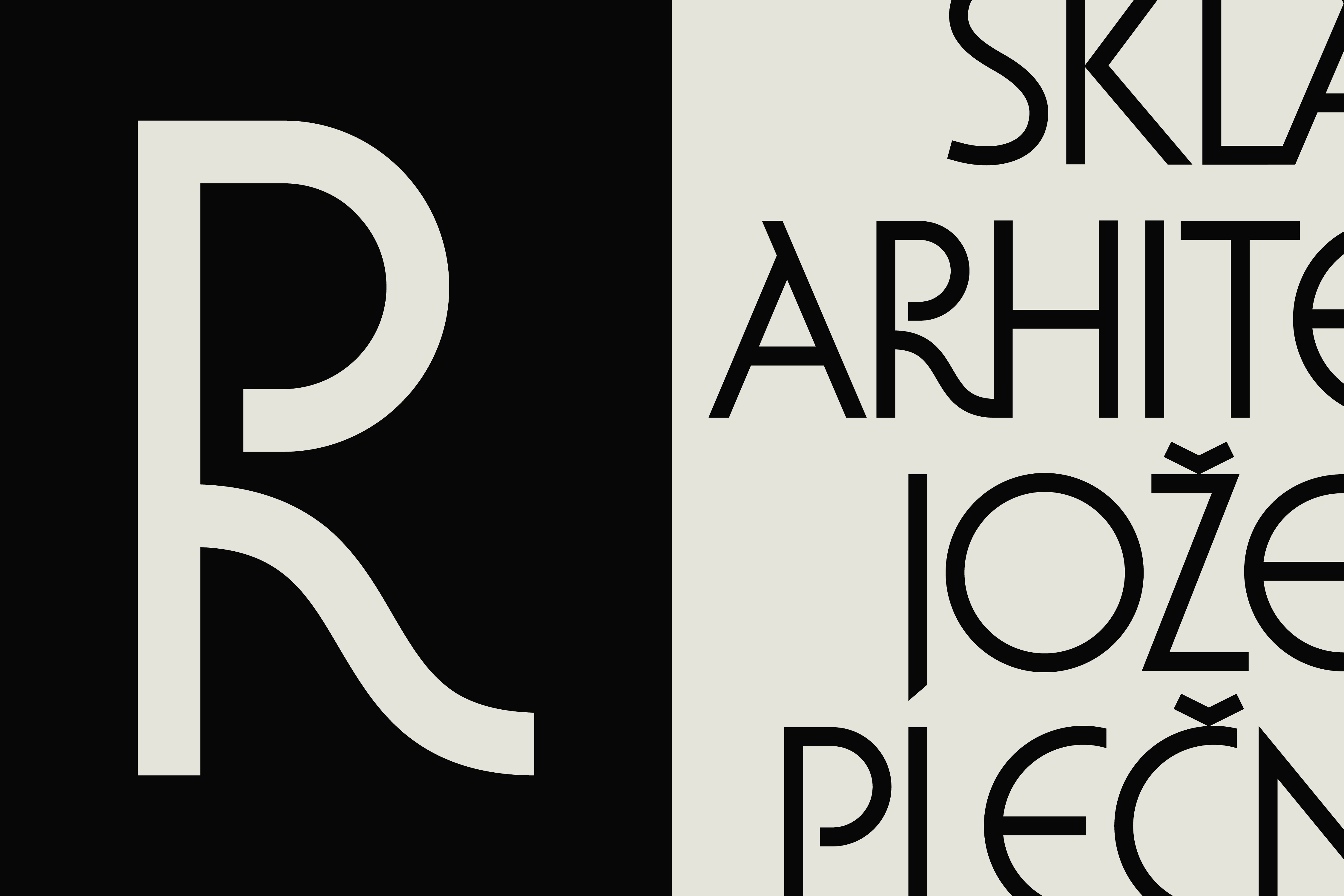
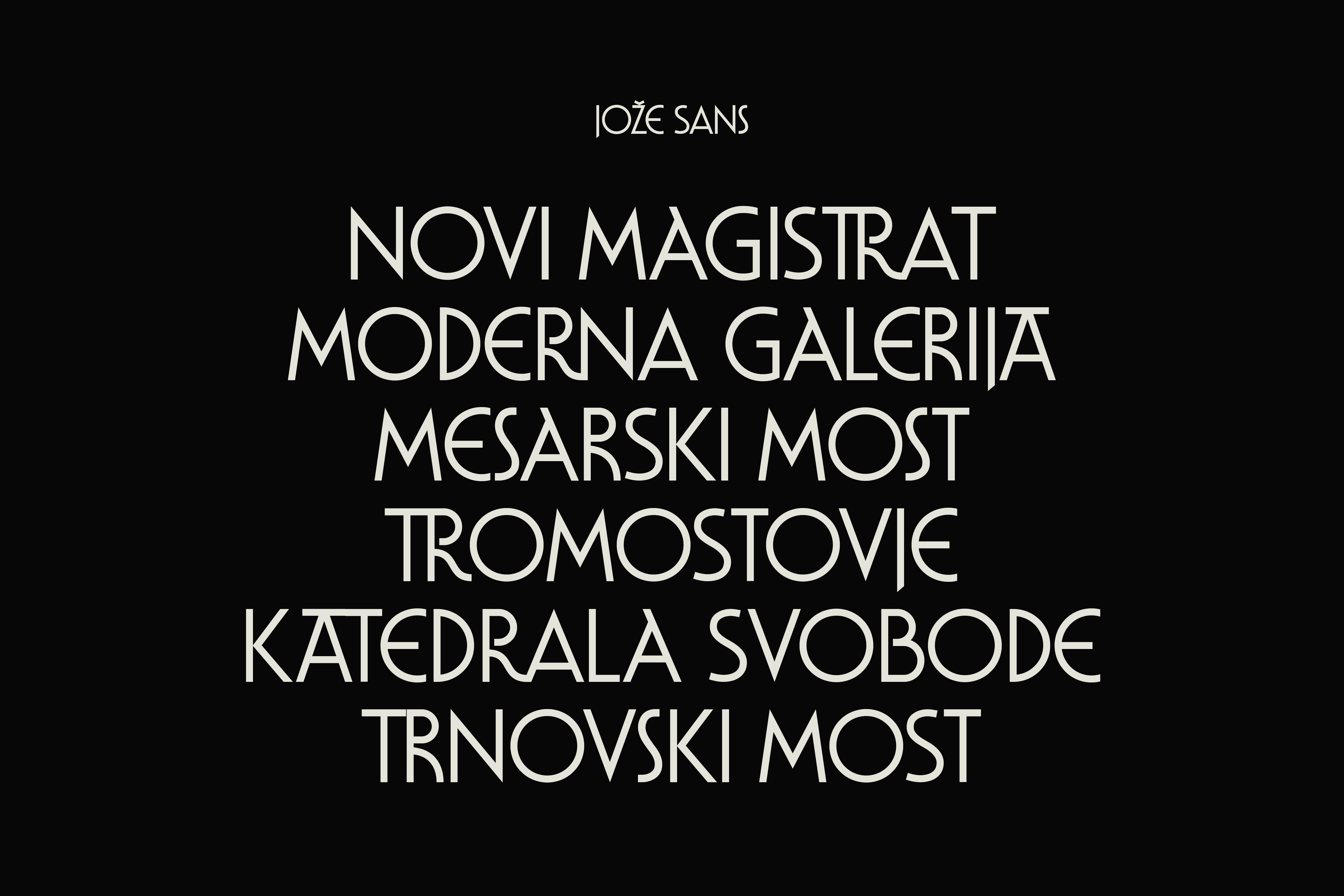
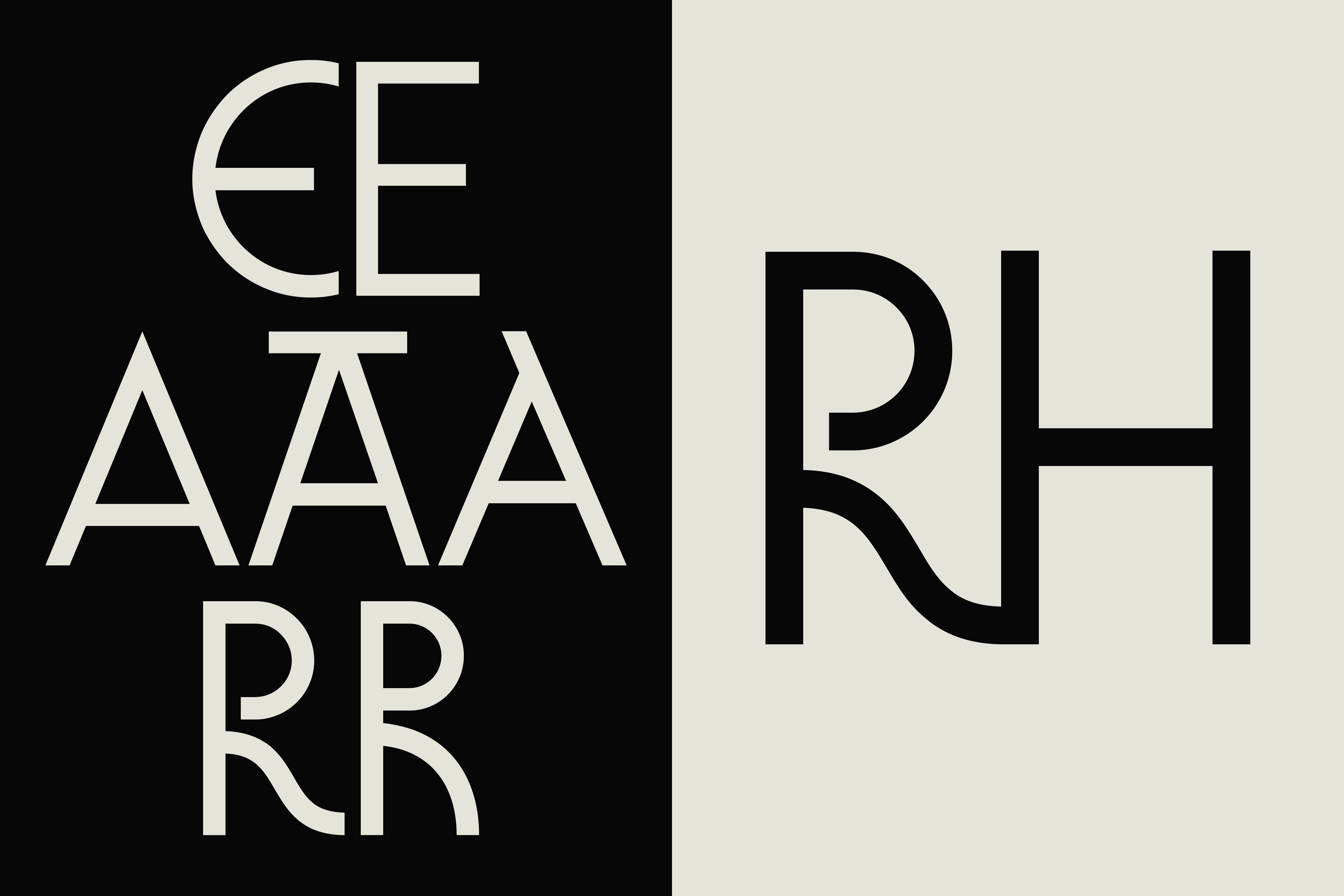
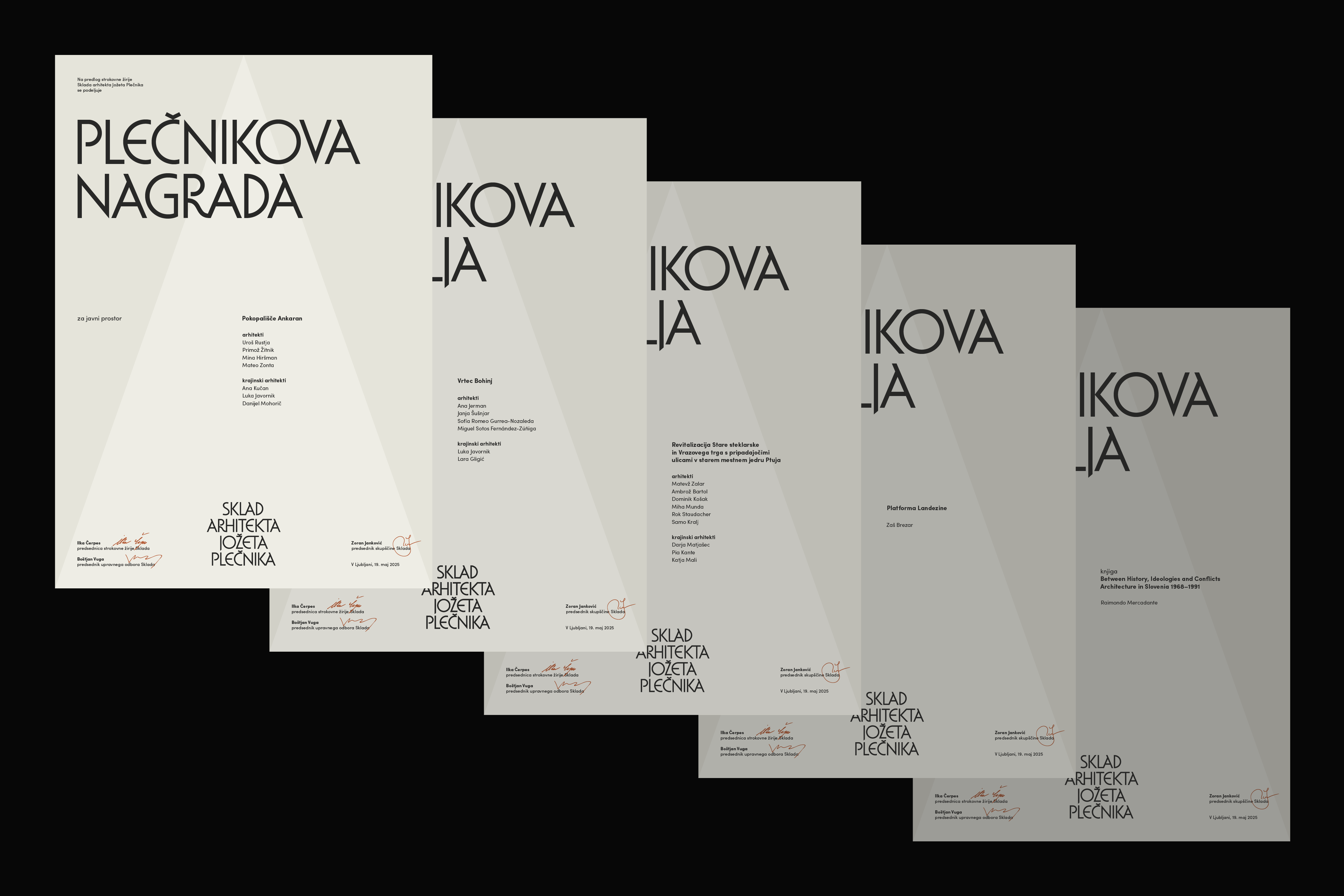
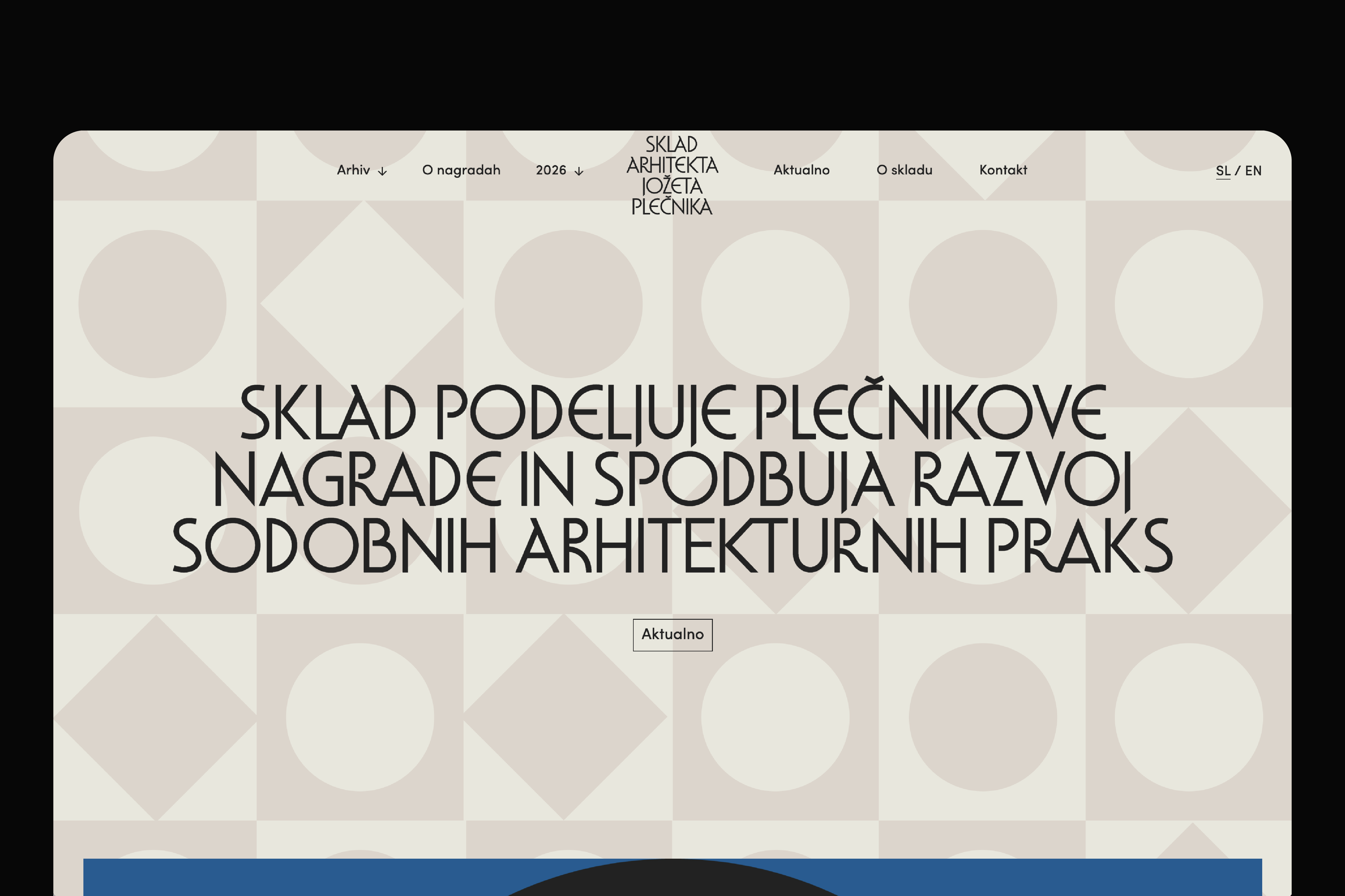
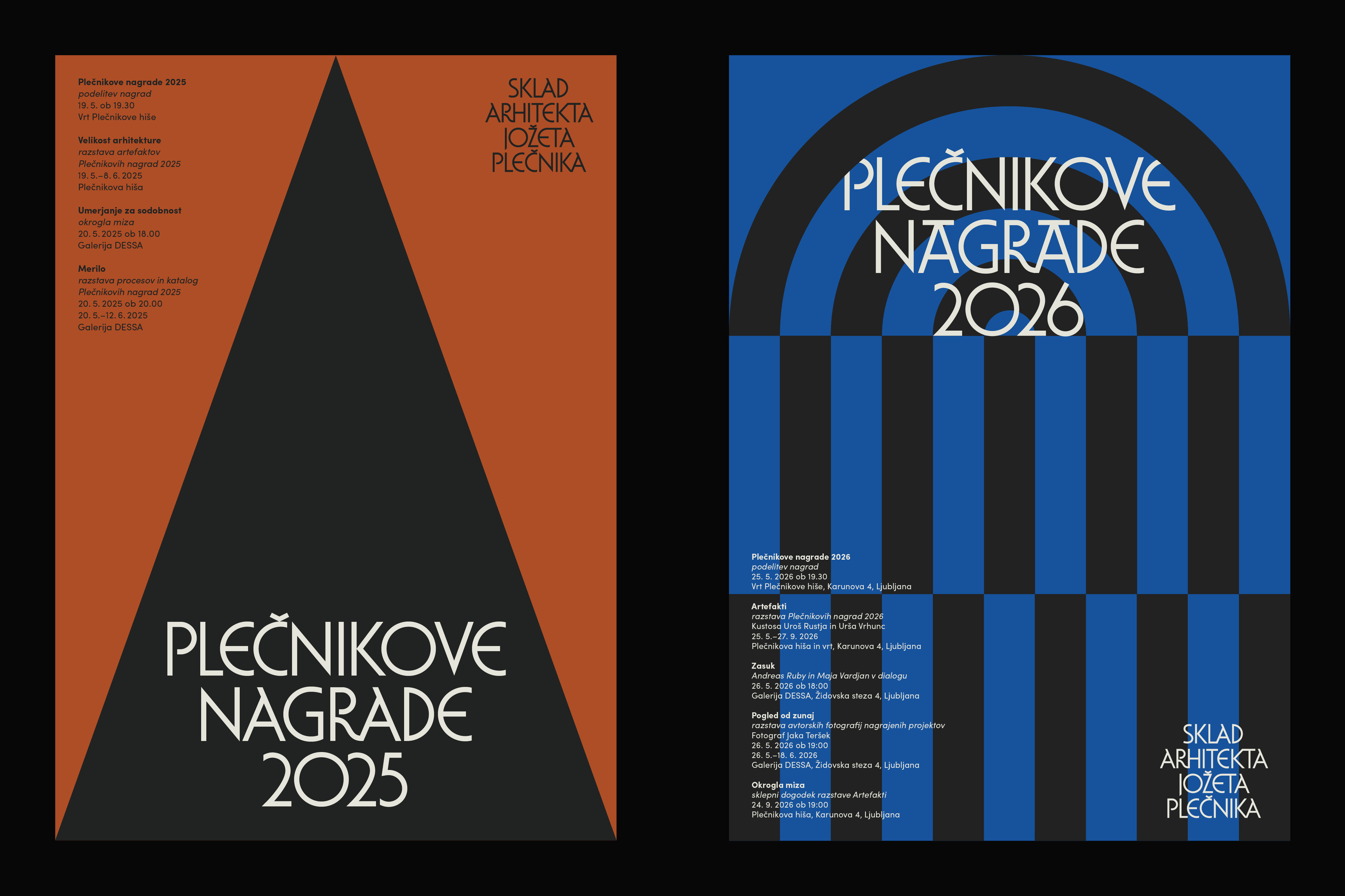
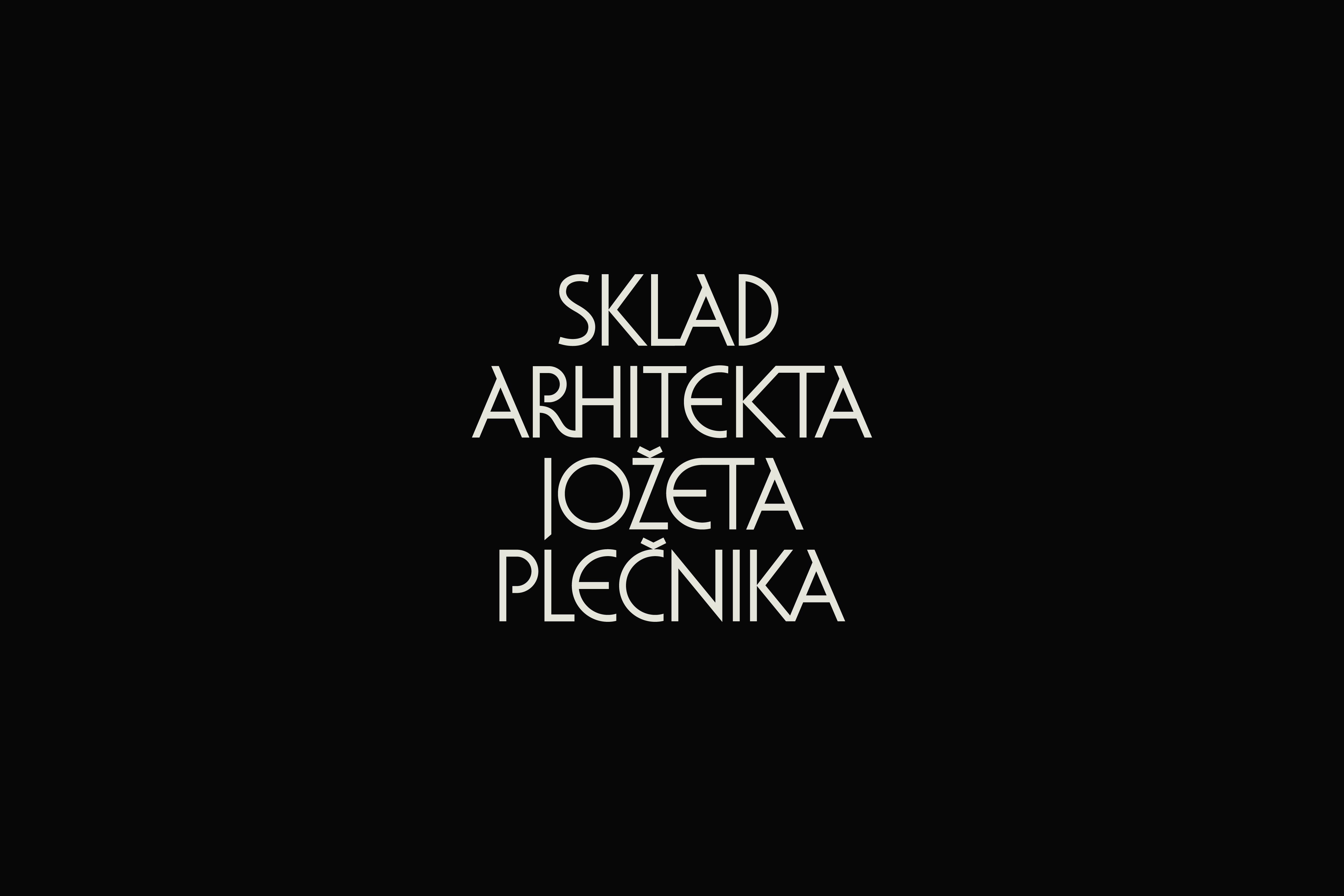
The identity of the Plečnik Fund is centred on a typographic mark rooted in Plečnik’s distinctive lettering. For the project, we developed a custom typeface whose characteristic details, ligatures and centred composition give the mark a unique personality. A supporting graphic system draws on the geometry, rhythm, textures and layered structures of Plečnik’s architecture. Graphic interpretations of selected motifs create a recognisable visual language for each annual edition of the Plečnik Awards.